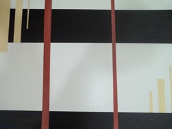
For this acrylic piece, I knew that I wanted to have just lines and to use them to create a sense of depth. For my color choice it was only fitting to choose a pair of complementary colors as well as a neutral tone in the background. I choose to use a pumpkin spice orange and navy blue as my two main colors for this piece and a faded yellow to just add some contrast. By placing the orange over the navy this piece appears to have a sense of depth and layering. The pumpkin orange really stands out against the dark navy. By having the yellow overlap the navy in the left hand corner it again appears to be that the navy is in the background while the yellow is in the foreground. However, by having the yellow staggered lines begin at the same level of the navy line on the bottom right hand corner, it almost appears that the navy is in the foreground while the yellow dissipates to the background. I also choose to have all these yellow lines in this piece to be staggered to add interest. Not one of the lines in this piece are of the exact same width. I purposefully choose to do this to add interest to this piece.
 RSS Feed