This is your new blog post. Click here and start typing, or drag in elements from the top bar.
This is your new blog post. Click here and start typing, or drag in elements from the top bar.
0 Comments
This is your new blog post. Click here and start typing, or drag in elements from the top bar. 
This is your new blog post. Click here and start typing, or drag in elements from the top bar. 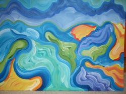 This painting was inspired from the many rolling wheat fields that I often pass by on the four hour car drive, 275 mile drive to Spokane.
 This acrylic painting is called Van Gogh Lake because of the choppy impressionistic brushstrokes throughout this piece.
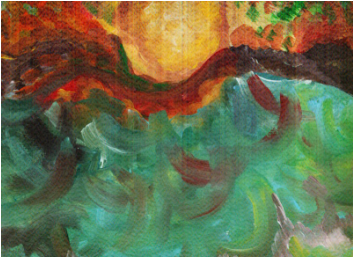
This painting is of a lake at sunrise. The fiery red sky with various hughes really were my inspiration for this piece. I really wanted to capture this piece, in my best abilities, and demonstrate to the rest of the viewers of my web page what i saw an was able to capture in that one quick brief moment in time. This is your new blog post. Click here and start typing, or drag in elements from the top bar. 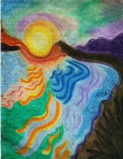 This is an abstract pastel drwaing of a lake at sunrise. In this drawing I really wanted to put some emphasis on the many reflected colors that appear in the lake as the sun begins to crest over the hills and the light begins to brighten the valley and lake.
The bold lines in the water represent the various waves as they make their way to the rockey shore and the sun's light reflects down upon them creating various bold colors. This is your new blog post. Click here and start typing, or drag in elements from the top bar. 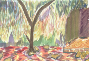 This watercolor painting is of an old tree in the middle of an abandoned courtyard in the fall. IN this painting i really wanted to emphasize the lines of color and blending of those lines in the fourground and background. I wanted to however make the tree in this peice solid in the the watercolor brush strokes sothat the tree would really stand out because the back wall of the courtyard as well as the ground are covered in leaves and moss sos they have some really bright colors where as the tree is mostly a greenish brown. I feel that this was accomplished quite well. The tree is separated from the rest of this painting in some sense which is exactly what i was going for.
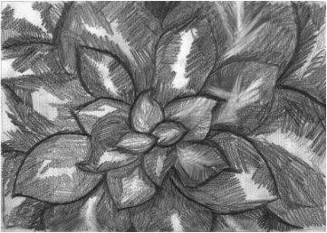 This is a value drawing close up of a hen and chick plant. I choose this plant to be my subject because I really wanted to focus on the layering of the leaves and also the fact that each of the leaves were slightly curled inward. I do believe that I accomplished the illusion of layering (which gives this drawing depth) but, not so much on the leaves being curled.
Inthis sketch I also wanted to try and see if stokes of lines on the same plane going in opposite directions according to the subjects shape, would give each leave a sense of movement. 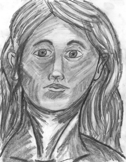 This still life portrait is of a young woman. I am not quite sure who exactly the woman in the drawing is because I drew her facial features and characteristics based of Mrs. Heideman’s self portrait tutorial.
The portrait tutorial was so very much so helpful to me. Before going through all fourteen pages, I thought I had some sort of idea how to draw a face but oh boy was I wrong. I now realize that my eyes would always be too high up the forehead of my person sketch and the nose was ok, but the mouth and ears were terribly disproportional. Actually, My figure drawings never seemed to have any ears now that I think about it. Oops….. Oh well. I still am not too sure how to properly shade the face (that is why the woman in the portrait looks kinds skinny around the cheek bones and her face still looks flat instead of plump and three-dimensional). I believe that the shading given to the subject’s hair really gives is depth and a sense of the hairs on her head blowing in the wind so to speak, and also a sense of layers. The bright white lines are lighter hairs on top of the darker more thick lines which lie under layers of other hairs. This is a water color painting of an apple staggered behind a small, miniature pumpkin. This strategic placement of the two objects was done to not only get the eye to move more in interest, but to also give this piece a sense of depth and perspective. 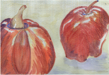 | AuthorWrite something about yourself. No need to be fancy, just an overview. ArchivesMay 2011 Categories |
 RSS Feed