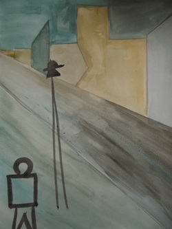
Modern Skyway is the last of my pieces for my theme blogs for this semester. It has a very personaly symbolic meaning which can be read in Theme Blog 2012. This watercolor piece is my only watercolorpiece for this semseter and by far took my the longest to accomplish. It was difficult to get straight edge lines and to come up with something simple and yet complex. The colors used here are very dull and two toned. I choose these darker colors of olive greens and indigo blues because nlike all of my other pieces, i wanted this one to be a little bit more dark and solem. I wanted to keep this piece really simple and leave it up for interpretation by viewers.
This is your new blog post. Click here and start typing, or drag in elements from the top bar.
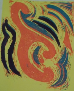
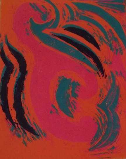
Overall I am satisfied with the way both of my block prints have turned out. I achieved my goal of symmetry and they are a unique piece to look at. However, there are several things I would like to change about my prints. The first being that in both prints it is evident that some of the layers did not overlap and whats left is a shifted layer of colors. In both prints I would also have liked them better if the areas where I had previously carved out the designs was not evident. I feel that in doing so these prints would have turned out much more clean and would leave both of these prints to look more sharp and less mucky. The yellow print is byfar my favorite print of the two. Each layer of colors is easily defined unlike the other one. The orange and pink ink color choices are too close together making this print more difficult to see each layer and overall leaves this print to be more dark. The final thing I wish I had done too my block print when carving it would be to have added a border around the main squiggle. This addition would have added some definition to the whole piece and also add some separation.
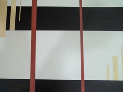
For this acrylic piece, I knew that I wanted to have just lines and to use them to create a sense of depth. For my color choice it was only fitting to choose a pair of complementary colors as well as a neutral tone in the background. I choose to use a pumpkin spice orange and navy blue as my two main colors for this piece and a faded yellow to just add some contrast. By placing the orange over the navy this piece appears to have a sense of depth and layering. The pumpkin orange really stands out against the dark navy. By having the yellow overlap the navy in the left hand corner it again appears to be that the navy is in the background while the yellow is in the foreground. However, by having the yellow staggered lines begin at the same level of the navy line on the bottom right hand corner, it almost appears that the navy is in the foreground while the yellow dissipates to the background. I also choose to have all these yellow lines in this piece to be staggered to add interest. Not one of the lines in this piece are of the exact same width. I purposefully choose to do this to add interest to this piece.
For this piece I was just browsing on the internet to better grasp an understanding of my theme. In the end I realized that the term “geometric” didn’t mean I was to be confined to painted squares or other geometric figures to create one whole image from those figures, but that rather this term also meant pattern. It all has to do with patterns that generally have straight lines, but can also include curved lines.
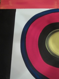
After doing some brainstorming, I had come up with this design. I knew that I wanted to use bold colors because the more bold and vivid the colors, the more of a statement the piece has. Which is why you see the yellow against the black in the center of the target on the right side of this piece. This can also be seen as well through the orange stripe atop the painting adjacent to another splash of black.
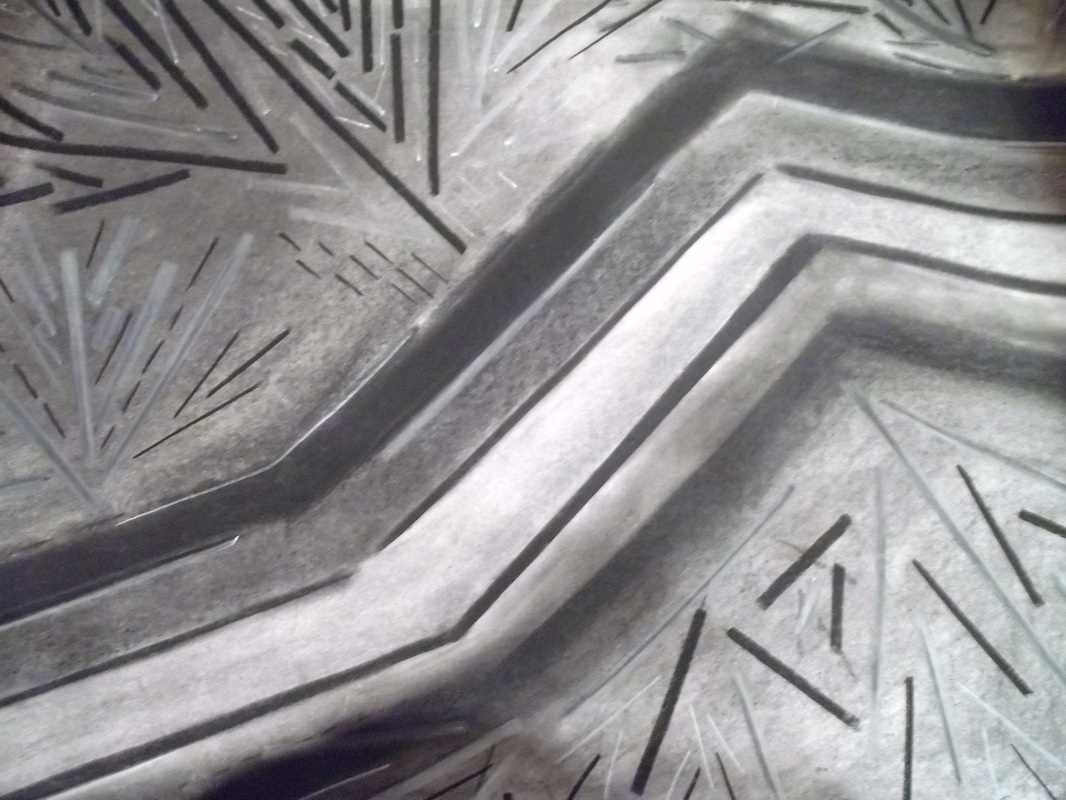
I initially wanted this charcoal drawing to be a magnified picture of a leaf. I choose to represent this organic plant because I wanted to experiment with lines. To have them be of different lengths, and widths to create the illusion of depth and space. Through this peace I have also experimented with value. Some of these lines appear to be black and of a heavier width to make them bold and standout. However, next to some of these big, bold lines lie some greyish white lines. The lines in this light shade are generally more petit and thus giving them a much more soft appearance against the bold lines. Having these two dramatic values against one another creates a false sense of depth and gives the illusion of space as well.
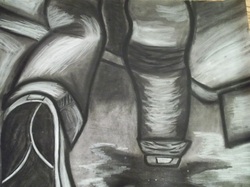
This piece is my finished charcoal drawing for this project. Overall I am very satisfied with this piece. There is very good value and all the different shapes and objects can easily be identified without having them be obviously outlined. In creating this final the only problem I faced was value and trying not to smudge the charcoal I had lain down. The value was also another aspect of this final that was difficult to capture. To make soe places more white than others but to have those objects not be completly white at the same time was something difficult to achieve for me personally. The shadows were also a difficult aspect of this piece. Shadows are represented by very dark lines that surround an object but in this case i wasnt too sure how exactly to add those in since some of my objects were already so darkly shaded in black. However in the end, i feel that i was able to use my intuition to solve these challenges and in the end produced an excellent first ever charcoal drawing.
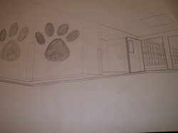
I personally found this corner to be much easier to capture. The angles and lines were much easier to visualize and capture because it seemed to me so straight forward. There were not really any trickey corners or walls. There was howvever this one place on the left side wall by the first pawprint that was most challengeing. There was a janitorial door and right adjacent to that there is the girls restroom, but at the angle I was sitting it appeared t be the door for the restroom but that also within that door was another door which in reality wasnt the case, but the angle made this appear to be the case. One other aspect I found to be difficult was the one and only light fixture within my picture. I am not too happy with the way it looks and i feel that the proportion is slightly off. Finally proportions were a real strugle through out this entire piece and whole porject. But despite these flaws and struggles, I feel that I have capturedd what I saw to the best of my abilities and am quite proud of the end results in both pieces.
This is your new blog post. Click here and start typing, or drag in elements from the top bar.
This first hallway drawing is of an interior corner in Mount Si High School's hallway right by the staircase. This hallway and corner i found especially difficult to capture correctly. The corners were very jaged and just as one corner would go in, another would come out. This aspect was probably the most difficult element to capture for me personally. Another difficult thing for me to remember when completeting this project would be the fact that every, every, every line must line up to the two side vanishing points and depending on whether or not you were trying to capture and interior, or exterior corner, one of them the vanishing points had to match up opposite. right to left, and left to right.
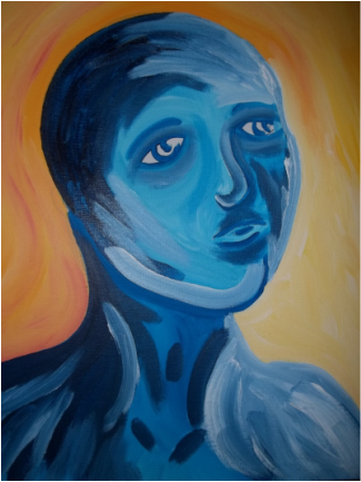
This painting is a selfportrait of myself. The message I am trying to convey is sadness with a sense of mystery. The eyes not directly looking forward give this painting the impression as though I am looking at something into the offset distance which evokes mystery into the viewer. What am I really looking at with such an intense gaze?
The colors chosen help express the emotions I am trying to convey. I painted myself entirely blue because this specific color is generally most accosiated with sadness or mourning. The vivid, bright yellow background adds severe contrast to this piece. I choose such a dramatic background color to contrast the dark shades of blue and to enstill more intense dramatic emotions within the viewer .
 RSS Feed